Colour is having a moment — but the biggest change isn’t about one particular shade taking over our homes according to interior colour trends across 2026. Instead, colour is becoming more considered, more layered and much more integrated into the way we design our spaces. From warm neutrals and rich browns to mossy greens, smoky blues, rosewood and earthy terracotta, the emerging palette is bringing depth and personality back into interiors. Importantly, colour isn’t stopping at the walls… it’s appearing across kitchens, bathrooms, cabinetry, tiles, stone, timber, furniture, appliances, lighting, textiles and accessories, creating homes that feel more individual and connected.
The most exciting thing about today’s colour movement is that there isn’t one correct palette. Warm neutrals can sit alongside rich browns. Green can behave like a neutral. Smoky blue can replace traditional navy. Rosewood can soften darker interiors, while clay and terracotta bring warmth and personality. And colour no longer belongs just to paint. It is in the timber, stone, cabinetry, tiles, furniture, textiles, lighting and objects that make a house feel like home. So rather than asking “What colour should I paint my walls?”, perhaps the more interesting question is: “What colour story do I want my home to tell?”
The Real Colour Trend for Now
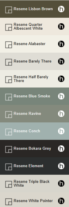
Looking across the latest interior colour trends 2026 from Dulux, Resene and Habitat by Resene, the most interesting shift is perhaps not a particular colour at all — it is greater confidence with colour. After years dominated by cool greys, stark whites and safe neutrals, interiors are becoming warmer and more expressive. Dulux’s 2026 Colour Forecast, for example, explores three distinct directions: Elemental, with grounded warm neutrals, browns and charcoals; Evoke, with richer earthy and vintage-inspired colours; and Ethereal, with softer greens, mauves and blush tones. Habitat by Resene is seeing a similar movement, with deep, almost-black shades sitting alongside delicate washed colours, while moss, forest greens, indigos, rosewood, smoky blues and soft sage bring a more nuanced middle ground. The result is a palette that feels natural but not predictable. Think warm white walls paired with walnut cabinetry. A muted green kitchen island against natural stone. A smoky blue bathroom with brushed metal fittings. A chocolate-brown sofa softened by linen cushions. Terracotta tiles alongside pale timber. The future of colour isn’t about choosing one shade and putting it everywhere. It’s about creating a colour story that flows through the way you live.
Warm Neutrals Are Becoming the New Foundation
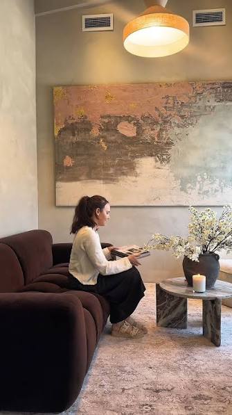
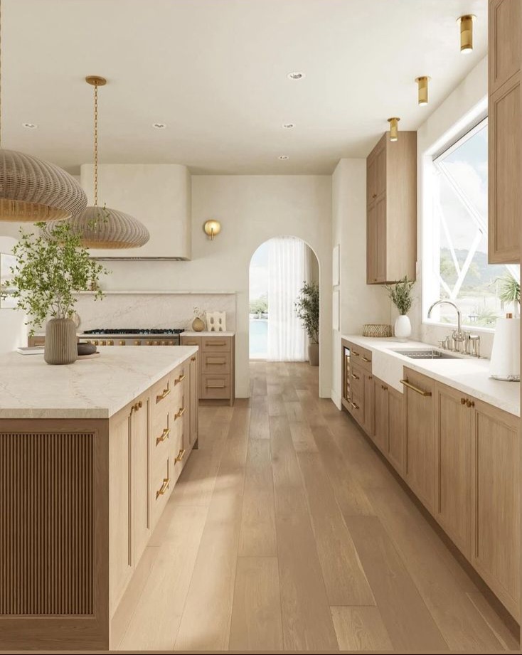
Neutrals aren’t disappearing — they’re evolving. Instead of icy whites and blue-based greys, we’re seeing warmer whites, creamy off-whites, beige, oatmeal, mushroom and soft stone shades becoming the backdrop for contemporary homes. These colours create an easier foundation for layering stronger shades without making a room feel visually overwhelming. They also work beautifully with natural materials such as oak, walnut, limestone, travertine, linen, wool and textured ceramics. For homeowners planning a renovation, this warmer neutral approach in interior colour trends 2026 can also be a smart long-term choice. Rather than relying on a stark white interior that can quickly feel dated, a warmer base allows you to introduce personality through cabinetry, furniture and accessories — and change those elements more easily over time.
Brown Is Back — And It’s Much More Sophisticated
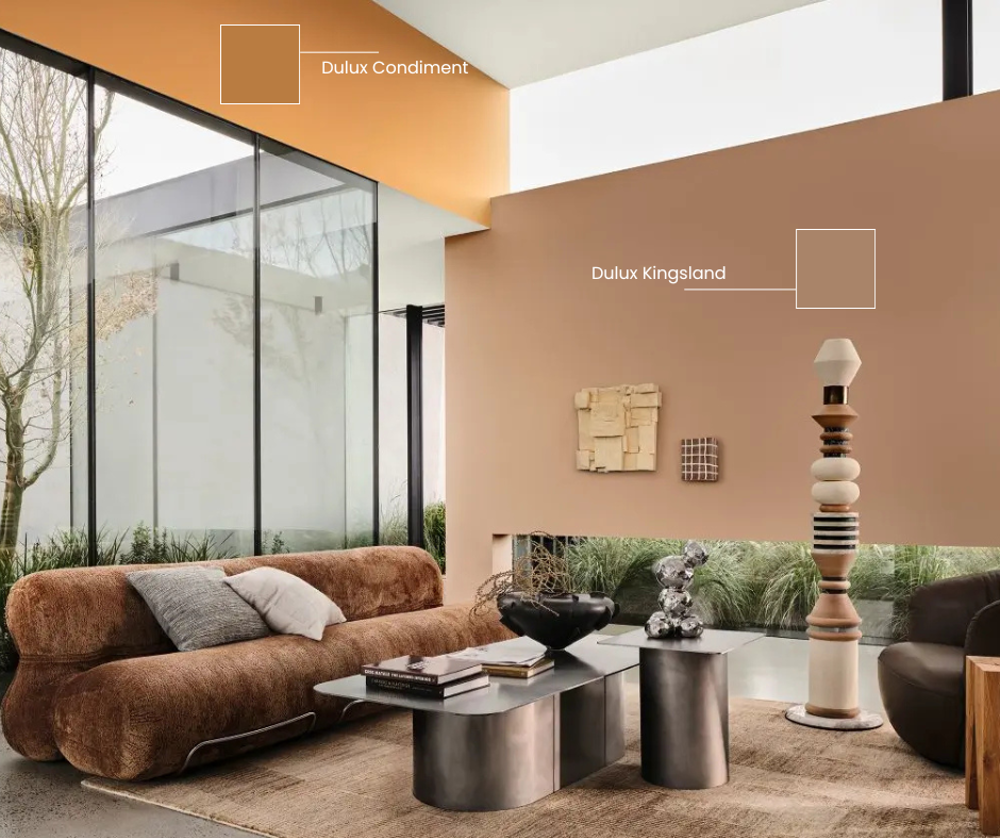
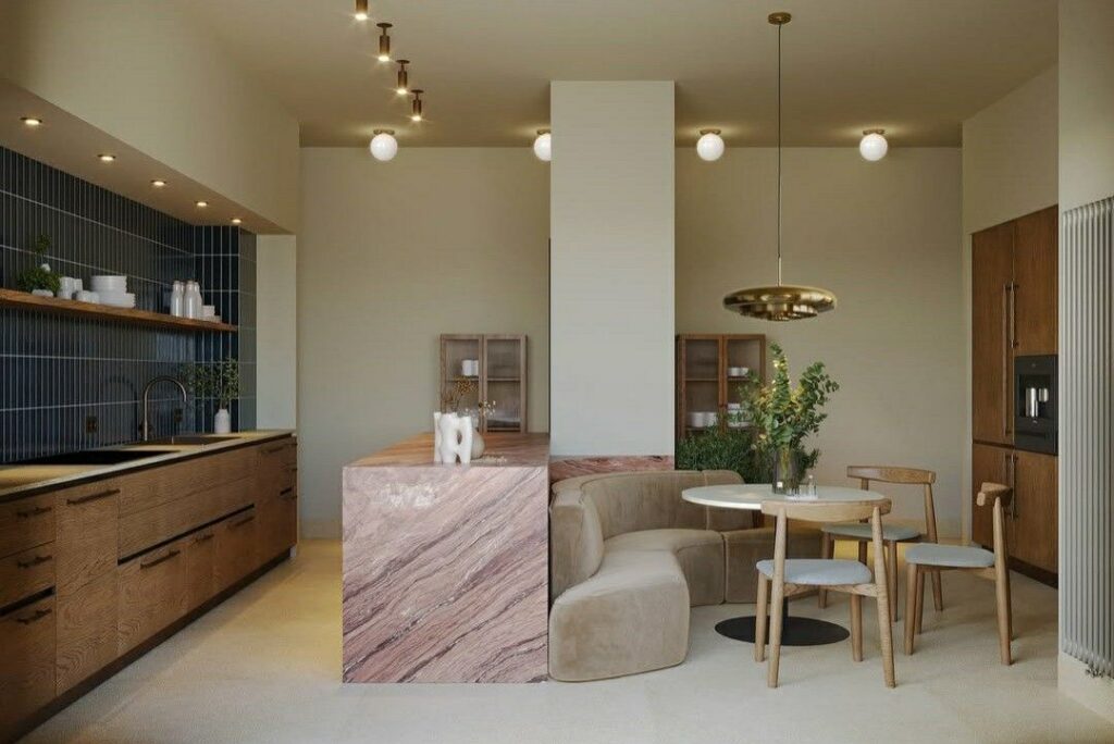
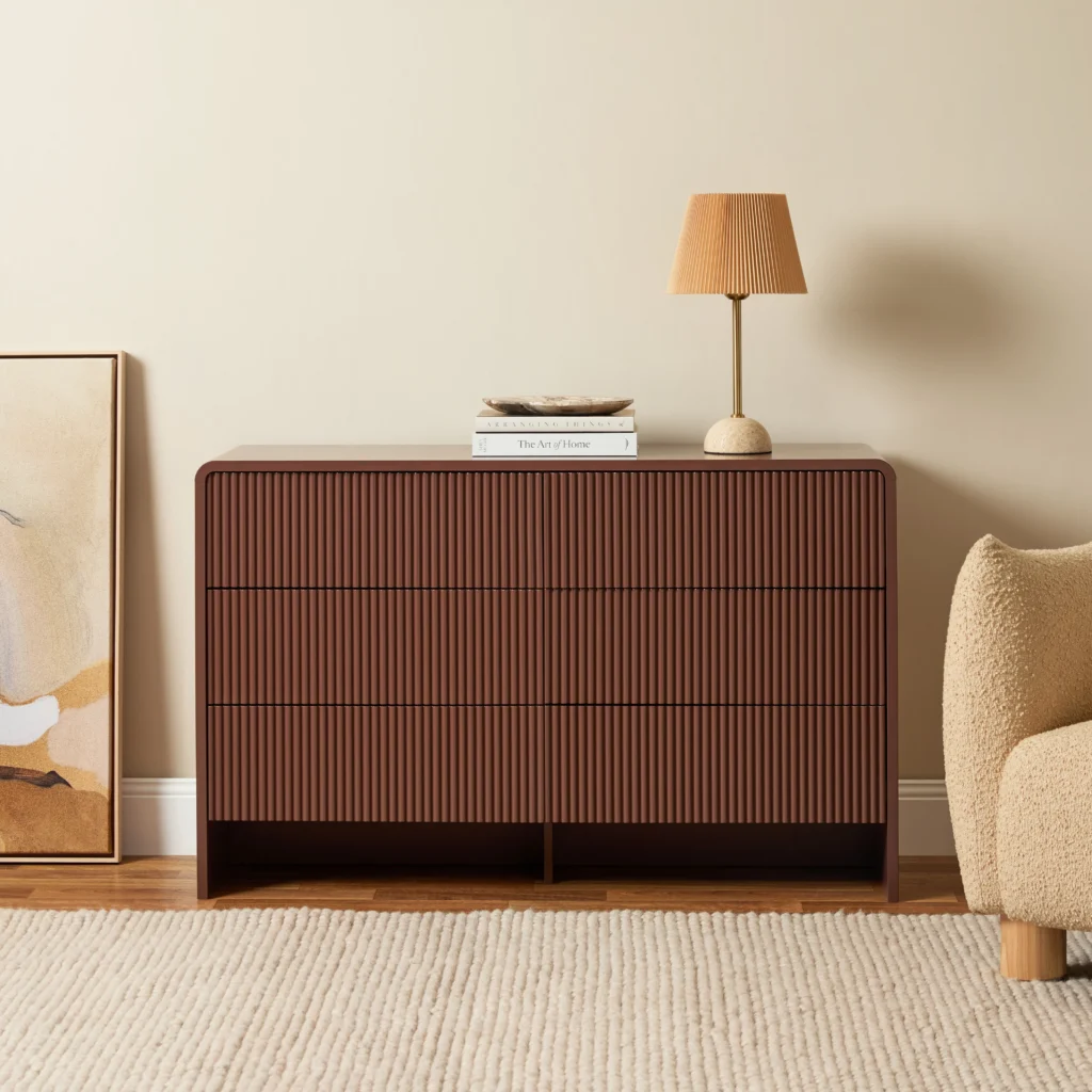
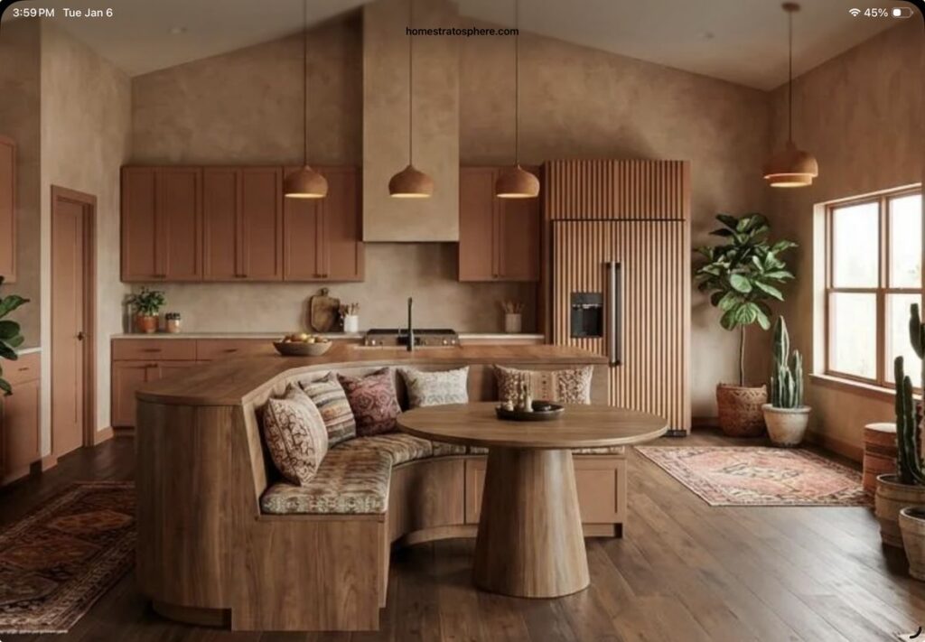
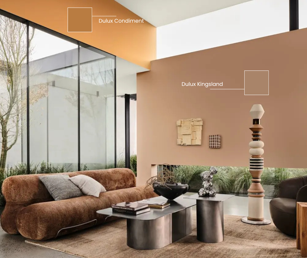
Brown has been steadily moving back into interiors, but this isn’t the heavy, dated brown of previous decades. Today’s browns range from pale mushroom and warm taupe through to tobacco, chestnut, caramel, walnut and deep chocolate. They bring an immediate sense of warmth and can make contemporary spaces feel more grounded and inviting. Habitat by Resene highlights warm browns with pink undertones, while its designers have also identified softened, brown-cast blacks — described as “black chocolate” — as an emerging alternative to harder blacks. Brown is particularly effective when combined with natural materials. Think walnut cabinetry, dark timber furniture, chocolate upholstery, warm stone and aged brass. Used well, brown doesn’t make a home feel dark. It can make it feel comfortable, sophisticated and lived-in.
Green Brings Nature Indoors
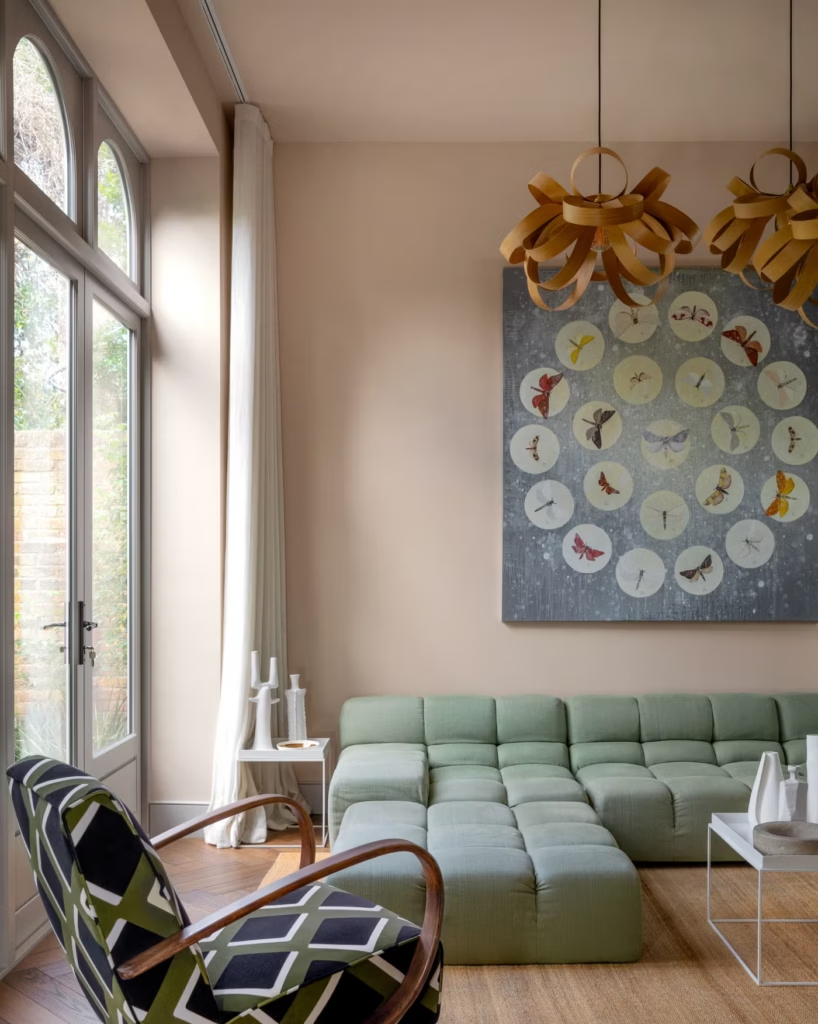
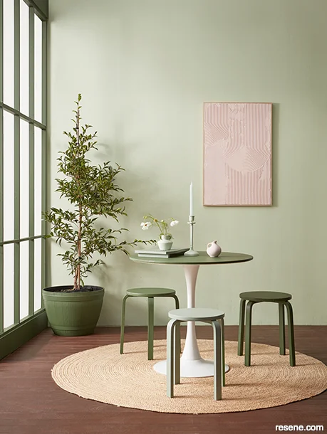
Green continues to be one of the most versatile colours in the home. Sage, olive, moss, eucalyptus and deeper forest greens are increasingly being treated almost like neutrals because they work so naturally with timber, stone and other organic textures. A soft sage can create a calm backdrop in a bedroom or bathroom, while a deeper olive or forest green can give a kitchen island or built-in cabinetry real presence. Green is also particularly effective in New Zealand homes, where the relationship between architecture, landscape and the outdoors is often an important part of the design. Rather than thinking of green as a statement colour, consider it part of the home’s natural palette.
Rosewood and Pinky Browns Add Softer Warmth
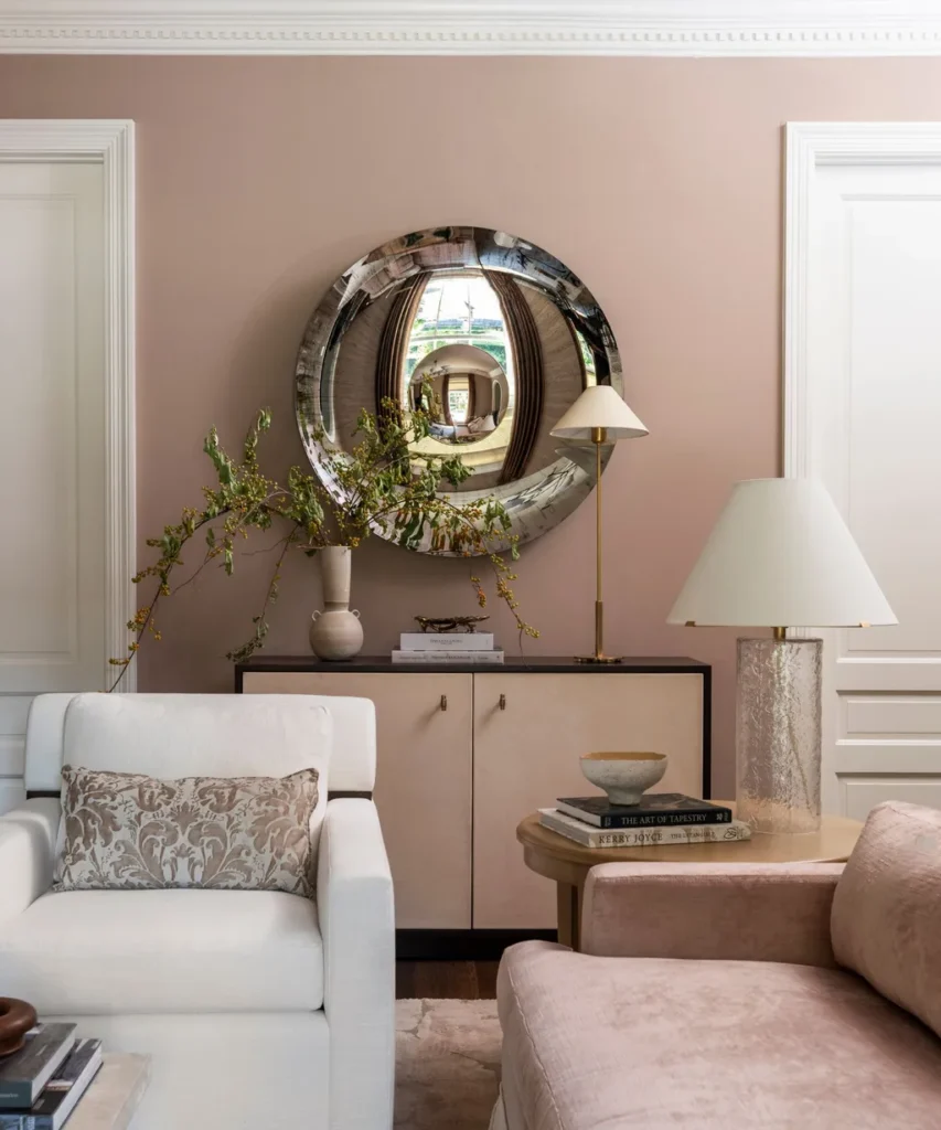
One of the more sophisticated directions emerging in colour forecasting is the return of rosewood-inspired shades — warm browns carrying subtle pink or red undertones. These colours sit somewhere between brown, burgundy and dusty rose, creating a warmth that feels richer than traditional beige without becoming overly colourful. They can work beautifully in dining rooms, bedrooms and living spaces, particularly when paired with cream, timber, aged brass and natural stone. For those who aren’t ready to paint an entire room, rosewood tones can be introduced through an occasional chair, artwork, rug, cushions or ceramics.
Indigo and Smoky Blue Bring Depth
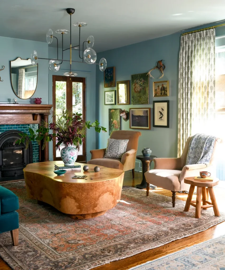
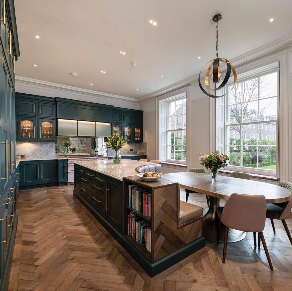
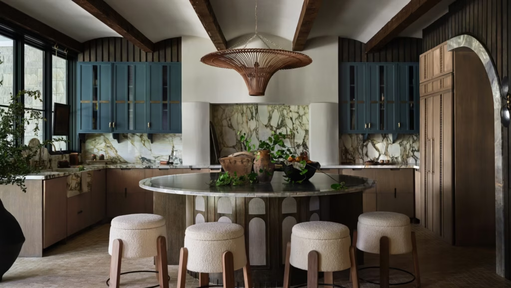
Blue is becoming more complex too. Rather than bright coastal blues, current palettes are leaning towards deep indigo, ink, denim, smoky blue and greyed mineral tones. These colours bring depth without the intensity of a highly saturated navy. A smoky blue can feel particularly sophisticated in a bathroom, study or bedroom, while deep indigo cabinetry can create a dramatic focal point in a kitchen. The softer versions are also easy to combine with warm whites, timber and stone, making them more versatile than their deeper counterparts.
Clay, Terracotta and Warm Orange Add Personality
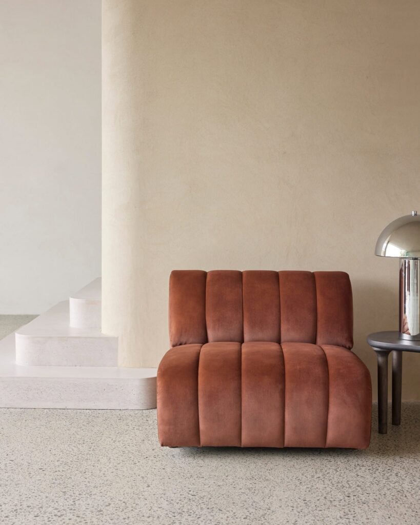
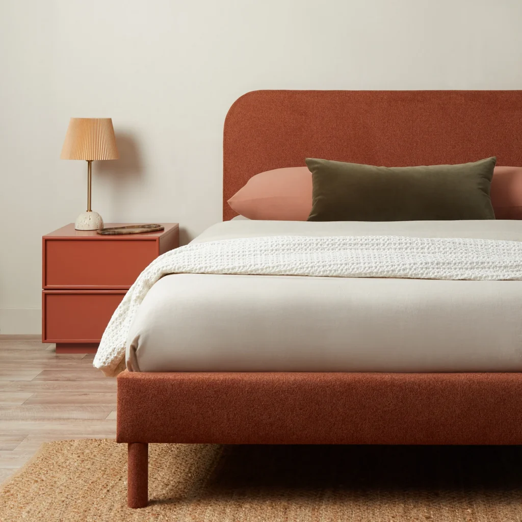
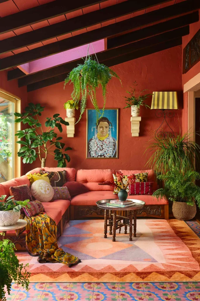
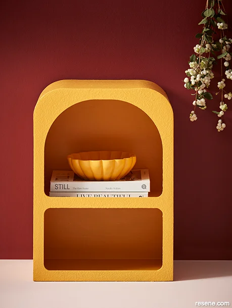
Earthy reds, clay, terracotta, rust and muted orange are another important part of the warmer colour movement. These shades connect strongly with natural materials and can add energy without feeling overly bright. They work particularly well with cream, warm beige, olive green and timber. You don’t necessarily need a terracotta wall to embrace the trend. A tiled splashback, upholstered chair, pendant light, rug or collection of ceramics can introduce the colour in a much more subtle way. The key is to choose earthy, slightly muted versions rather than highly saturated orange.
Colour Is Moving Beyond the Paint Tin
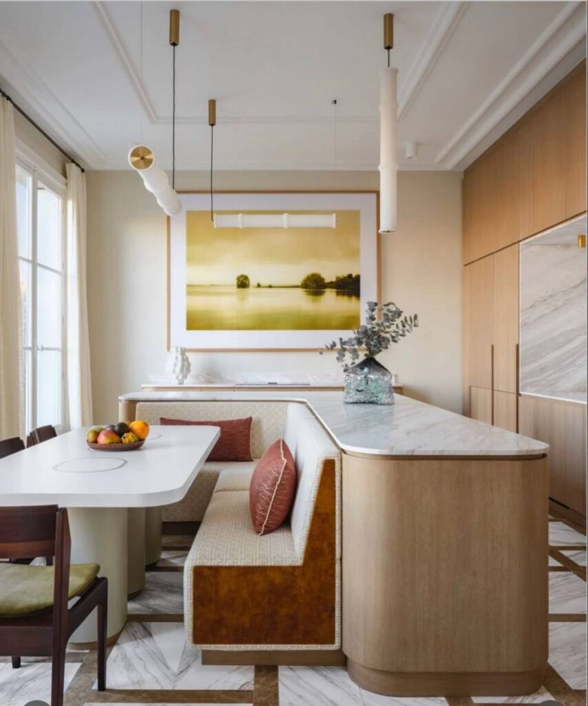
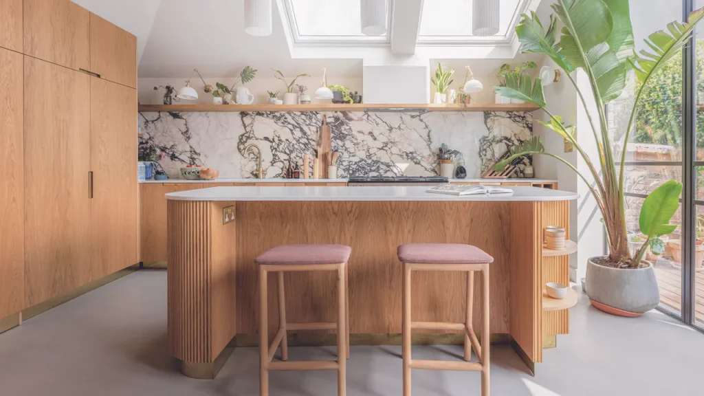
Perhaps the biggest opportunity for homeowners with interior colour trends in 2026 is to stop thinking about colour as something that belongs exclusively on the walls. A room can have a colour story created through cabinetry, benchtops, tiles, timber stains, furniture, fabrics, appliances and accessories. This is particularly noticeable in kitchens and bathrooms, where previously neutral architectural surfaces are becoming part of the overall palette. A warm stone benchtop can introduce colour without appearing colourful. A walnut vanity can provide richness in a bathroom. A muted green island can become the focal point of an otherwise neutral kitchen. This approach creates interiors that feel layered rather than decorated.
Kitchens Move Towards Natural Colour
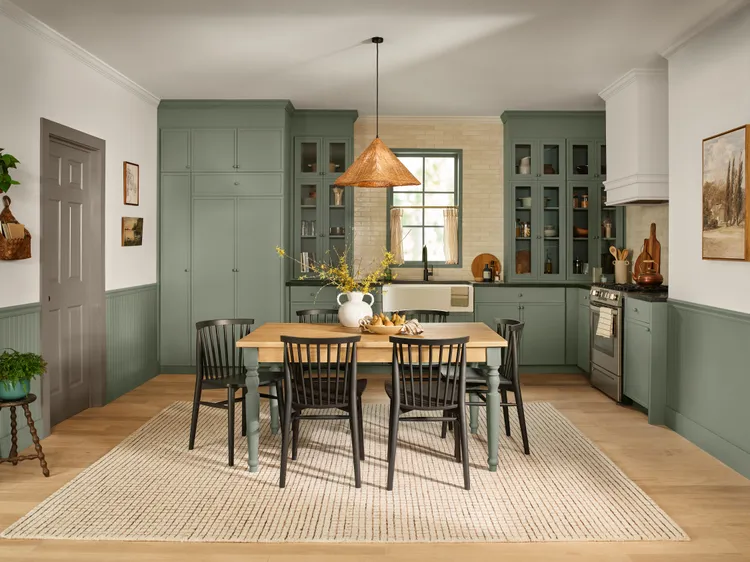
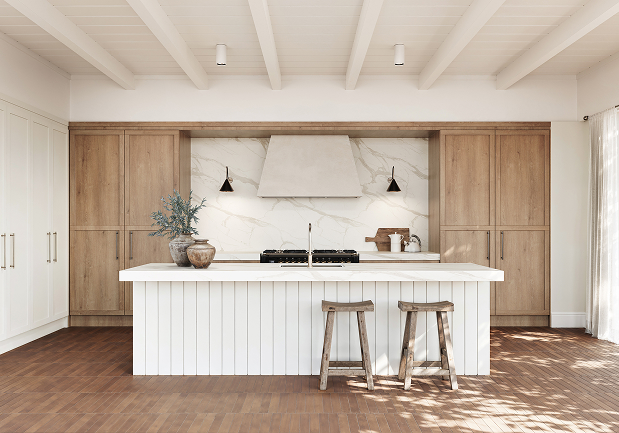
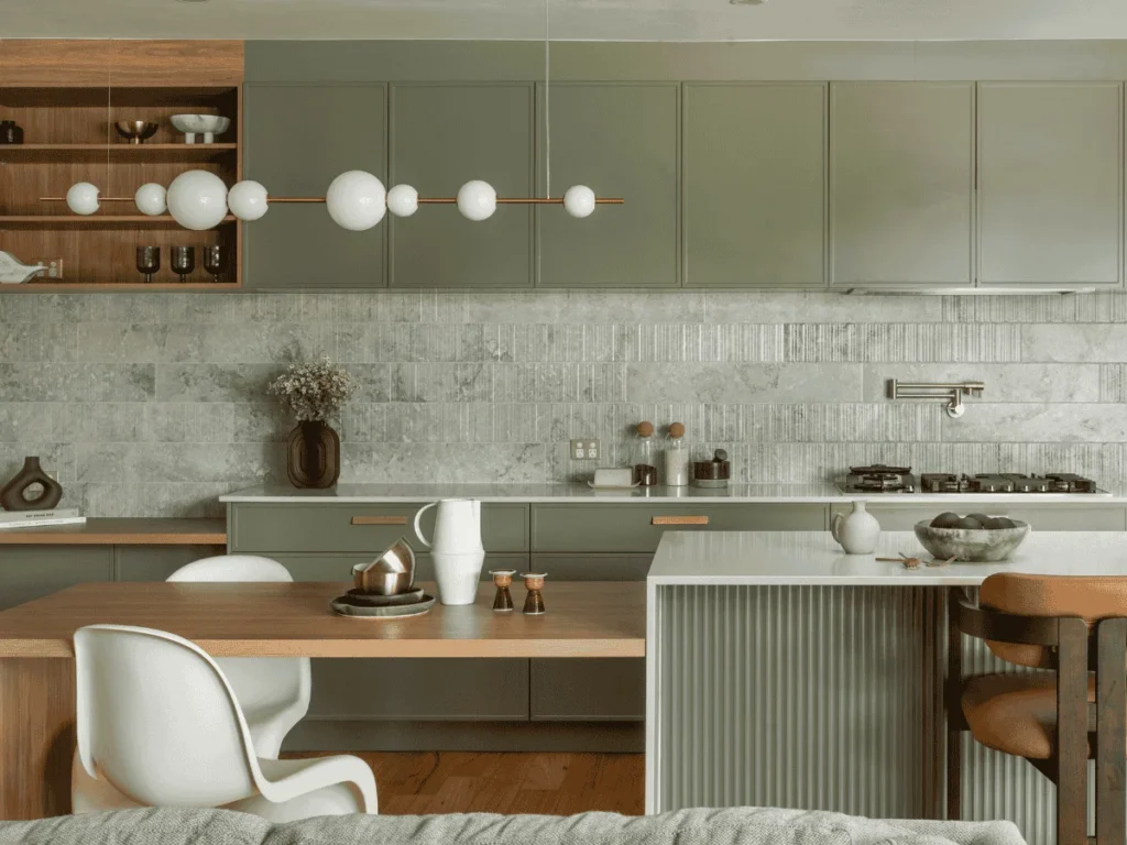
Kitchens are becoming one of the most interesting places to experiment with colour. While neutral kitchens remain popular, the definition of neutral is changing. Warm whites, creamy tones, timber, walnut, earthy stone and muted greens are replacing some of the colder whites and greys that dominated kitchen design for years. Habitat by Resene’s interior colour trends in 2026 highlight neutral kitchens alongside timber and contrasting muted grey-green cabinetry. The island is also becoming an obvious place to introduce colour. Rather than matching every cabinet, a contrasting island can provide a subtle focal point while allowing the rest of the kitchen to remain timeless.
Benchtops Become Part of the Colour Palette
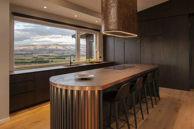
Benchtops are no longer simply a practical surface. With large-format porcelain, natural stone and engineered surfaces increasingly available in sophisticated colours and patterns, the benchtop can become an important part of the room’s visual identity. Warm whites, creamy stone, earthy browns, dramatic charcoal and mineral-inspired surfaces can all influence the colours chosen for cabinetry, splashbacks and flooring. The trend towards continuing the same material from benchtop into the splashback also creates a more seamless effect, allowing the surface itself to become a major design feature.
Green Is Finding Its Way Into Kitchen Cabinetry
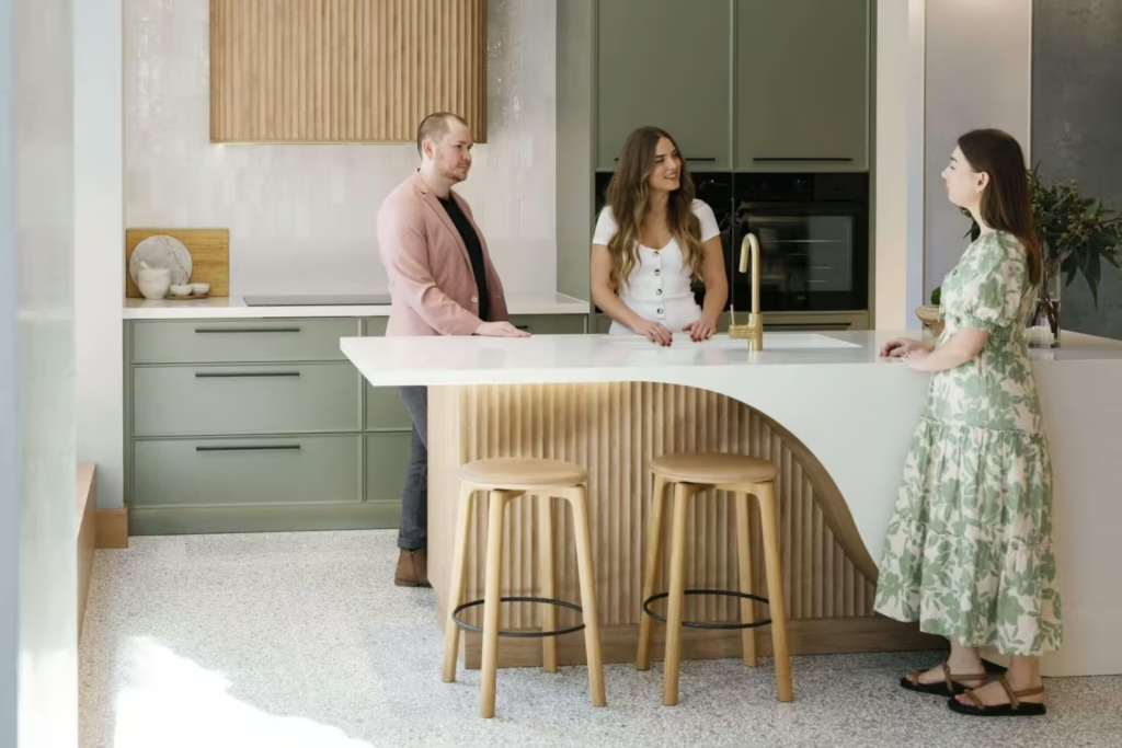
Green cabinetry deserves its own mention because it has become one of the most convincing ways to introduce colour into a kitchen. Muted sage, olive, eucalyptus and deeper grey-green shades work beautifully with timber, brass, stone and warm white walls. For homeowners worried about committing to a full-colour kitchen, using green on an island or a bank of cabinetry can provide the same effect with less visual impact. It also creates a strong connection between the kitchen and the natural environment outside.
Bathrooms Are Becoming Warmer and More Atmospheric
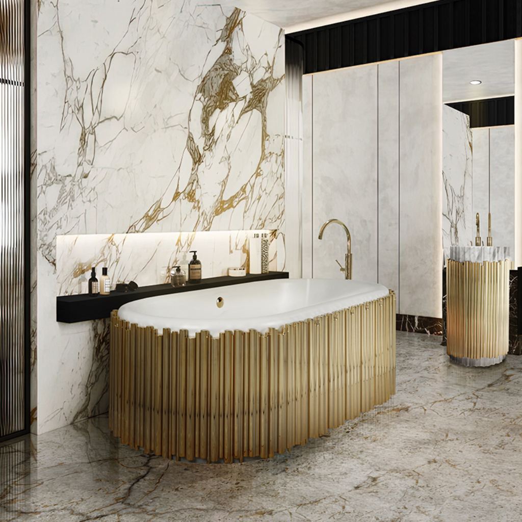
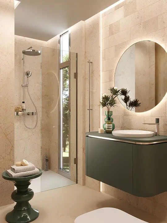
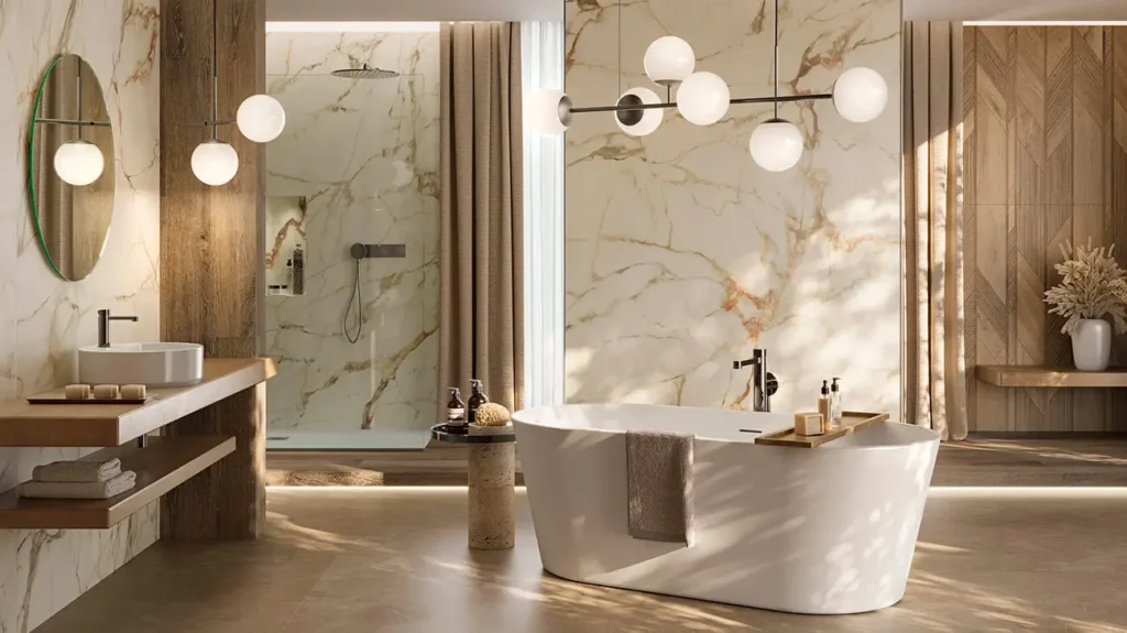
Bathrooms are moving away from purely clinical white spaces and towards something much more atmospheric. Deep greens, charcoal, navy, warm beige, earthy browns and soft mineral colours are being used to create rooms that feel more like retreats. The combination of darker colour with stone, timber, marble and warm metal finishes can be particularly effective. This doesn’t mean every bathroom needs to become dark. Soft sage, smoky blue, warm white and muted clay can create the same sense of personality while maintaining a lighter feel.
Tiles Are Bringing Colour and Texture
Tiles are becoming another opportunity to bring colour into a home. Instead of using a feature tile simply as a decorative statement, colour can be integrated through the architecture of the room. A muted green tile in a shower, a warm clay floor tile or a soft blue splashback can create a strong sense of atmosphere. Texture is important too. Handmade-looking surfaces, irregular edges, subtle variations and tactile finishes can prevent colour from feeling flat. The result is more characterful than a perfectly uniform surface.
Timber Adds Colour Without Paint
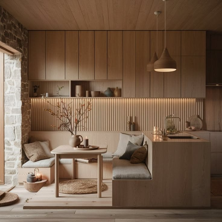
Timber has become increasingly important to the warmer interior palette. Oak, walnut and darker timber stains can introduce significant visual warmth without adding a traditional “colour” to the room. This is particularly useful for homeowners who prefer restrained interiors. A room with warm white walls, timber cabinetry and natural stone can have a surprisingly rich colour palette without using strong paint colours at all. Timber also helps balance deeper shades such as charcoal, forest green, indigo and chocolate.
Metal Finishes Are Part of the Colour Story
Tapware, handles, lighting and hardware may be small details, but they can influence the overall feeling of a room. Brushed brass and aged brass work naturally with warm colours, while black and darker metals can create contrast against lighter surfaces. The shift towards warmer interiors is also encouraging a move away from overly shiny finishes towards more tactile, brushed and aged surfaces. Rather than choosing metal finishes in isolation, consider them alongside the room’s timber, stone, cabinetry and paint colours.
Appliances Are Becoming More Decorative
The kitchen appliance is increasingly becoming part of the visual design rather than something to hide away. Colourful or statement appliances can provide a small but effective dose of personality, particularly in kitchens where the cabinetry and benchtops remain relatively restrained. This is an easy way to experiment with a trend without committing to permanent finishes. A beautifully coloured kettle, coffee machine, rangehood or refrigerator can become almost like a piece of furniture within the kitchen.
Furniture Carries the Colour Through the Home
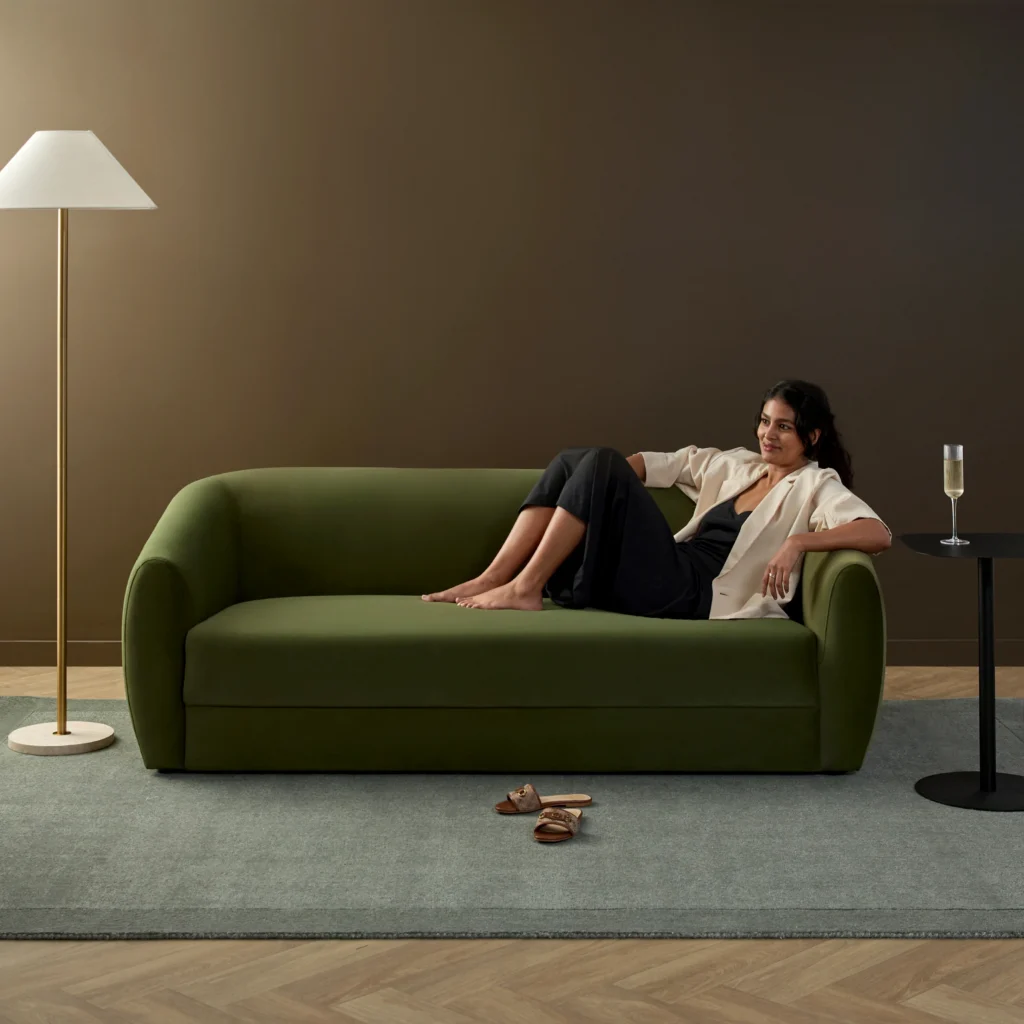
Furniture is one of the easiest ways to make a colour palette feel intentional. A chocolate sofa, olive armchair, dusty rose occasional chair or deep indigo headboard can introduce a stronger colour without requiring a complete room makeover. This is where the idea of a whole-home colour story becomes particularly useful. A shade introduced in the kitchen might reappear as upholstery in the living room. The warm brown of a timber vanity could be echoed through a leather chair. A muted green from the garden might appear again in cushions or artwork. The colours don’t need to match exactly. They simply need to feel as though they belong together.
Accessories Make Colour Easy to Change
For anyone who prefers to keep permanent finishes timeless, accessories provide an easy way to participate in changing colour trends. Cushions, throws, rugs, artwork, ceramics, lamps and decorative objects can introduce seasonal or emerging shades without requiring a renovation. This is also where you can have a little more fun. A neutral room can support a surprisingly adventurous collection of accessories, allowing you to experiment with colours such as raspberry, ochre, lilac, rust or indigo. Habitat by Resene’s colour trends 2026 point towards unexpected combinations such as ochre with lilac, moss with dusty rose, and marine blue with tobacco or rust. The important thing is not to make every colour work independently. Give them a common thread through tone, texture or natural materials.
Creating a Whole-Home Colour Story
The most successful colour schemes don’t necessarily use the same colour in every room. Instead, they create a sense of connection. Start with a foundation of colours and materials that you genuinely love. Warm white, timber, stone and one or two earthy neutrals might form the base. From there, introduce one or two stronger colours that can appear in different ways throughout the home. Perhaps green becomes the connecting colour, appearing as kitchen cabinetry, bathroom tiles, a living-room chair and garden-inspired artwork. Or perhaps your palette centres around warm browns and natural timber, with touches of smoky blue and cream adding contrast. This approach makes a home feel considered without becoming overly coordinated.
Don’t Follow Colour Trends Too Literally
The best colour trend is ultimately the one that works for your home and the way you live. Trends can provide inspiration, but they shouldn’t dictate every decision — particularly when you’re choosing expensive or difficult-to-change finishes. If you love the idea of a dark green kitchen but aren’t ready to commit, try the colour on an island. If a rosewood wall feels too dramatic, introduce the shade through furniture or artwork. If you’re renovating a bathroom, consider bringing personality through tiles while keeping the larger fixtures timeless. The goal isn’t to create a home that looks like a interior colour trends brochure. It’s to create a home that feels like you.