The 2027 Interior colour trends palette is building on the warmth and confidence of 2026, with warmer neutrals, earthy greens, softened blues and richer accent colours taking centre stage. Think creamy stone and sandy tones, olive and botanical greens, atmospheric blue-greens, powdery blues and deeper shades of plum, berry, burgundy and earthy red. Dulux’s 2027 Colour Forecast explores these ideas through its Sensory, Play and Treasure palettes, while Resene’s current colour direction includes earthy and nature-inspired tones alongside richer shades such as Seaweed, Rewilding, Black Doris, Blackberry and Half Aubergine. Together, they point to a more layered approach to colour — warm, sophisticated and expressive without feeling overwhelming.
We’re seeing a more thoughtful approach to the way colours work together — and how they connect with timber, stone, texture, furniture, lighting and the architecture of a home. 2027 isn’t about choosing the colour of the moment. It’s about creating a colour story that feels like you.


Our Pick of 12 Colours for 2027
We’ve selected a mix of Dulux and Resene shades that capture the broader direction for 2027 Interior colour trends — from warm neutrals and nature-inspired greens to softer blues and richer, moodier accents.
- Resene Seaweed — an earthy olive green with depth
- Dulux Duvauchelle — a warm, natural neutral
- Resene Rewilding — a deep, grounded green
- Dulux Whale Bay — an atmospheric blue with a sophisticated feel
- Resene Parchment — a soft, earthy neutral
- Dulux Kingsland — a richer, nature-inspired tone
- Resene Field Day — a muted botanical green
- Dulux Herald Island — a softened blue-green
- Resene Black Doris — a dramatic, sophisticated dark shade
- Resene Blackberry — a deep berry with warmth
- Dulux Silo Park — a rich crimson red
- Resene Half Aubergine — a rich, moody purple
The appeal of these colours is in how easily they can be combined. A warm neutral can soften a deeper green; a powdery blue can lift earthy tones; while berry, aubergine or burgundy shades can add depth in smaller doses. Resene’s current trend material similarly highlights the continued appeal of nature-inspired colours, warm neutrals, deeper greens, blues and richer accent shades.
Kitchens: Colour at the Heart of the Home
The kitchen is one of the strongest places to bring the 2027 interior colour trends into your home. Coloured cabinetry can add personality without making a kitchen feel overly trend-led. Olive and botanical greens work beautifully with timber and natural stone, while softer blue-greens and warm neutrals offer a calmer alternative to an all-white scheme. For a more understated approach, keep the main cabinetry neutral and introduce colour through an island, pantry cabinetry or a freestanding piece. For something more confident, take the colour across the full cabinetry scheme and balance it with simple stone, timber and warm metal finishes. The key is to consider the cabinetry, benchtop, splashback, flooring and hardware together rather than as separate decisions.


Bathrooms: Create a More Enveloping Space
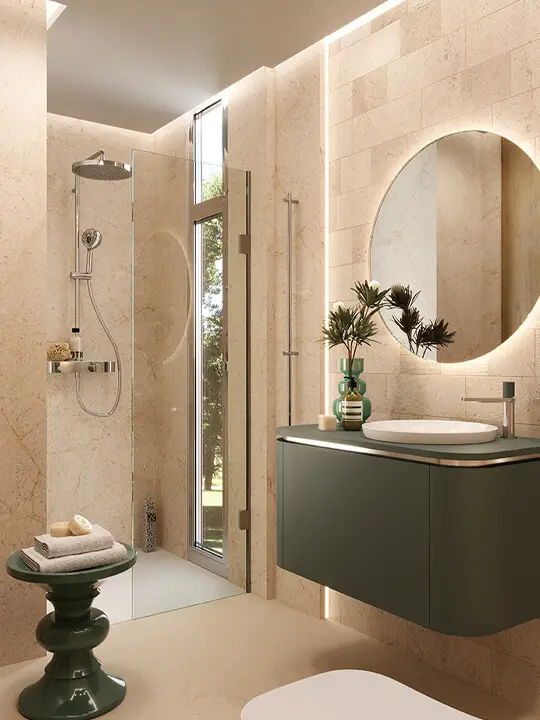
Bathrooms are also moving beyond the predictable white-and-grey palette. A soft green vanity, warm neutral walls and natural stone can create a calm, spa-like feel, while powdery blue can bring a lighter, more relaxed mood. Deeper greens, aubergines and earthy reds can create a more dramatic bathroom, particularly when used across walls, cabinetry or tiles. And if you’re not ready to commit to colour in a main bathroom, the powder room is the perfect place to experiment.


Living Areas: Layer Colour Through the Room
Living rooms are where colour can become more personal. Rather than choosing one statement shade, build a palette through the larger pieces in the room — sofa, occasional chairs, rug, curtains and artwork — then introduce smaller accents through cushions, ceramics and accessories. A warm neutral backdrop might sit alongside deep green upholstery, walnut timber and touches of plum. Alternatively, soft blue can be introduced through artwork and textiles against warmer walls and natural materials. The result doesn’t need to match perfectly. The aim is to create a room where the colours feel connected rather than co-ordinated.


Home Interiors & Accessories: Where to Experiment
You don’t need to repaint an entire room to embrace the 2027 colour direction. Accessories are an easy way to introduce richer shades and test how they work within your home. Think coloured ceramics, glassware, lamps, artwork, cushions, throws, rugs and decorative objects. This is where deeper colours such as berry, burgundy, aubergine and rich blue can have real impact. A few carefully chosen pieces can bring depth to an otherwise neutral room without overwhelming it. Painted furniture and built-in joinery are another way to introduce colour with intention — particularly in studies, entryways, reading nooks and smaller spaces.
Bedrooms: Soft, Tonal and Cocooning
Bedrooms suit the quieter end of the 2027 palette. Warm neutrals, muted greens, powdery blues and soft earthy shades can create a relaxed atmosphere, while deeper colours can be used to make a bedroom feel more enveloping. Try taking one colour across the walls and joinery, then repeating it through bedlinen, artwork or a rug in slightly different tones. Timber, linen and other natural textures will add warmth and prevent the scheme from feeling flat.


The 2027 Takeaway
The colour story for 2027 isn’t about replacing everything that came before it. It’s about taking the warmth and natural foundations we’ve been embracing and giving them more depth, confidence and personality. Use colour where it feels right. Keep some spaces quiet. Let others be more expressive. Most importantly, look beyond the paint swatch. Consider how colour works with your home’s timber, stone, flooring, furniture, lighting and natural light. Because the next chapter in colour isn’t about following a trend. It’s about creating a home that feels considered, individual and completely your own.